Kara’s Top Tips for Great PowerPoint Slides

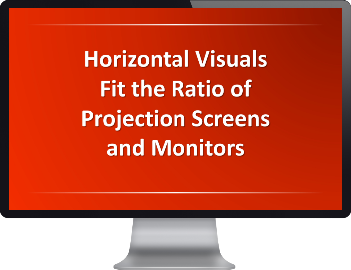
1Use a horizontal format

vertical visuals waste valuable space
WRONG
horizontal visuals fit the screen ratio
RIGHT

2Keep information concise

screen filled with text
WRONG
vs just two bullet points
RIGHT

3Use illustration to reduce words

image with only text
WRONG
vs image with an illustration
RIGHT

4Simplify visual information

image with only text
WRONG
vs image with an illustration
RIGHT

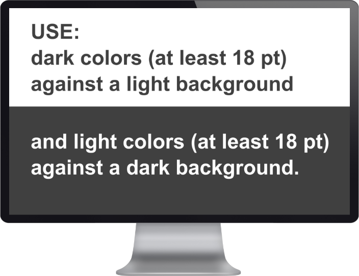
5Make your text readable

image with only text
WRONG
vs image with an illustration
RIGHT